Most printing in early modern and 19th century Germany used two font families: Antiqua and Fraktur. Both were ornate, old style typefaces that replicated calligraphic handwriting. Antiqua was employed mainly for printing Latin texts, while Fraktur was used more in German language documents.
During the rising German nationalism of the 1800s, many came to see Fraktur as a ‘German’ typeface and pressured the government and private printers to use it more. Otto von Bismarck refused to read books in ‘un-German fonts’ and Kaiser Wilhelm II also disliked them.
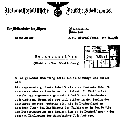
When the Nazis emerged in the early 1920s they also opted for Fraktur and its derivatives. The cover of Hitler’s Mein Kampf used a hand-drawn Fraktur font; official Nazi documents and letterheads also employed it. This continued until January 1941 when there was a remarkable shift in Nazi attitudes to typography. In an edict signed by Martin Bormann, the Nazis called for a ban on the future use of Judenlettern (Jewish fonts) like Fraktur:
“…I announce the following, by order of the Führer:
It is false to regard the so-called Gothic typeface as a German typeface. In reality, the so-called Gothic typeface consists of Schwabacher-Jewish letters. Just as they later came to own the newspapers, the Jews living in Germany also owned the printing presses… and thus came about the common use in Germany of Schwabacher-Jewish letters.
Today the Führer… decided that Antiqua type is to be regarded as the standard typeface. Over time, all printed matter should be converted to this standard typeface. This will occur as soon as possible in regard to school textbooks, only the standard script will be taught in village and primary schools. The use of Schwabacher-Jewish letters by authorities will in future cease. Certificates of appointment for officials, street signs and the like will in future only be produced in standard lettering…
Signed, M. Bormann.”
Ironically, Bormann’s memo went out under Nazi Party letterhead – which was itself printed in a Fraktur font. The reason for the Nazi turnaround on typefaces has never been definitively explained. One theory is that Hitler had a personal dislike of more ornate Gothic fonts; his increased reading workload in 1939-40 may have tripped his fuse and prompted the ban on Fraktur
Source: NSDAP memo on Judenlettern, signed by Martin Bormann, January 3rd 1941. Content on this page is © Alpha History 2019-23. Content may not be republished without our express permission. For more information please refer to our Terms of Use or contact Alpha History.
